
Wednesday, 28 November 2012
CD Cover Ideas
Rough Cut 2
Compared to the first rough cut, we have re-recorded some scenes such as in the arcades at different machines to give us more footage to add. We have also changed the opening scene as it uses a wider variety of shots such as extreme close ups of the girls eyes when she wakes up. We gathered much more footage for the rough cut however some of them were very dark, making it hard to see what the clip was showing. To improve this we will be re-filming the scenes which were too dark at an earlier time to make it visible to the audience.
Tuesday, 27 November 2012
Draft Advert Ideas
Below are some popular adverts for upcoming and already released albums and digipak adverts:
 The advert above shows a recent advert for an album. The use of including review feedback from other popular magazines helps promote the album further. I think it would be a good idea for us to include some form of feedback on our advert to make it look more professional with having to include the use of adding text when creating our advert along with making our poster seem more realistic.
 From the ellie Goulding Advert you can see they have included the title of the album and song it is promoting the most. This would be a good idea to include in our advert as it will make the album we are releasing seem real and unique rather than just having the name of the artist and a few comments of feedback.
 Compared to the above ideas, this advert doesn't have an image of the band, but a logo that represents the band and their genre. This gives the idea of mystery to what type of music they sing as you cant see their appearance. This could be good to consider in our advert however will we have to be very advance in the use of photoshop to create a convincing logo or image that will stand out and look professional.
 Unlike the others, this advert doesn't include an image of the band or some form of logo to cover the page apart from their band name, just a setting, this leaves you guessing what type of music they create. We could add this into or advert by selecting a scene such as the fireworks at the beach.
 Ed Sheeran is one of the artists that inspired us to chose this type of genre to focus on. Looking at his most previous advert it shows his face taking up the majority of the advert with the album details below. We could take some of these ideas into consideration to ours to help promote our music genre for example the image of his face, along with the image of the album underneath.
 This is the advert for our chosen song. We could use the ideas of having the names of both singers due to them not actually being a band together. We must also remember that we are not just promoting one song but an album however we should still take into consideration the genre of music we have chosen and have the adverts appearance represent this in some form of way.
Groups Opinion.
As a group after taking in all the ideas we had we thought we could use the centre of the advert to have the image of the two main singers but only with half their faces together, along with fireworks around the edge of the poster. We also thought we should add a wide variety of colours to our advert to make it stand out
Friday, 23 November 2012
Wednesday, 21 November 2012
Font Experimentation
For our digipak we have to consider the type of font we want. we have decided that it mustn't look too plain and boring but must be catching to the eye. Also, because our music is more upbeat we want our font type to express this along with our genre type, this means we dont want a type of font that looks eerie which would relate more to Rock music as an example. Below are some font examples we have in mind.
'A Yummy Apology' http://www.acidfonts.com/typeface/a_yummy_apology.htm

'Desperado!' http://www.acidfonts.com/typeface/desperado.htm
 'Jellyaka Jellyfish' http://www.acidfonts.com/typeface/jellyka_jellyfish.htm

'AtlandSketches' http://www.acidfonts.com/typeface/atland_sketches.htm
 'Earwig Factory' http://www.acidfonts.com/typeface/earwig_factory.htm
'A Yummy Apology' http://www.acidfonts.com/typeface/a_yummy_apology.htm
'Desperado!' http://www.acidfonts.com/typeface/desperado.htm
'Jellyaka Jellyfish' http://www.acidfonts.com/typeface/jellyka_jellyfish.htm'AtlandSketches' http://www.acidfonts.com/typeface/atland_sketches.htm
'Earwig Factory' http://www.acidfonts.com/typeface/earwig_factory.htmTuesday, 20 November 2012
Rough Cut 1
The first Rough cut being submitted. Owl City ft Carly Rae Jepsen - Good Time
Firstly i think our shots have been good so far because of the wide variety we have used. However i do have to be critical at the moment and i don't think the first Rough Cut is very good because of the long blackouts due to problems with footage not being synced in yet.
Also i have left one bit of footage synced but not in the correct state so the mime is off.
Secondly editing is taking a long time as expected just due to the lack of footage, so i have to leave bits empty but soon it will be resolved and look good.
Also i have to be disappointed in my own work ethic i definitely go to slow on the work, i need to improve my speed.
Furthermore Final cut is 'offline' for some of our footage with is rather annoying so hopefully we can reconnect some of the footage to put it in the music video.
Ways to improve
Firstly it is to get all the clips into the music video so it starts to come together and to reduce the blackouts until the final piece has been submitted.
Secondly to get the clips in sync so they all look capable for the mime. Lastly to finish all of the filming.
The filming is start to drag as of late but it is noone in the groups fault it is just unavailable locations which is holding us back. But this will be resolved in the next couple of weeks and hopefully the video can be back on track and succeeds in its potential.
Keep Saving the footage.
Photoshop Experiment - Fire Orb

This is the completed version of my fire orb.
At the first stage of the creation of the orb i started off by using the elipse tool, holding shift and drawing a circle.
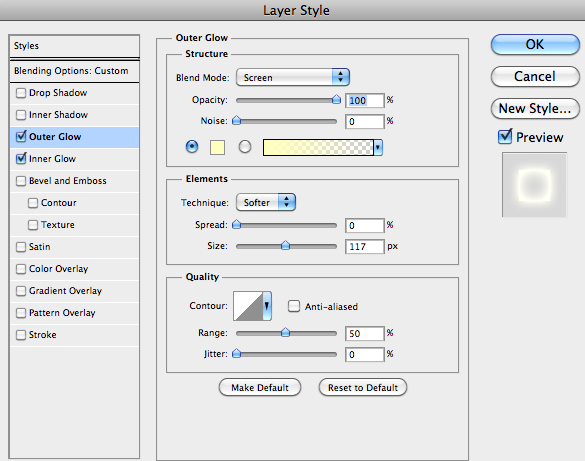
I used these settings to give the circle the glow.

After i applied these layer styles I ended up with this image below.

On another layer i used the brush tool and sed "White" colour and placed white circles around the circle.
I then used Filter > Distort > Twirl to give the below effect.

After that i used the brush tool again and set it to a pre-made bush and shrunk the size of the brush to fit inside of the circle.

After this is used these adjustments of the colour to change the current image to make it more fiery.


After this I rendered a cloud on a new layer and placed that layer under the circle layer.
i then used the same filter for the brush circles (Filter>Distort>Twirl) to make the cloud spin so that it fit with the direction of the flames.

the end result is that which is above, during the creation of this image i used a tutorial.
hopefully the techniques i used to create this image can be used to help create an advert or digipak for our music video.
Photo Shoot Ideas
Below are photo shoots from owl City and Carly Rae Jepsen that would be a good idea which we could include.


Tuesday, 13 November 2012
Digipak Ideas

The image above is the original cover for the single. I think the colours look too dark and doesn't really represent what the song is about. I have included some ideas below of what I think we could include in our digipak to improve the album that they have already used.


I think our genre and singer Owl City has the same style as Hellogoodbye and Carly Rae Jepsen usually sings up beat songs, therefore I think it is important that we use bright colours on our digipak to get the genre across and make the dikipak stand out.

The above album cover of Owl City shows us what we should include to resemble his participation in the song. I think it could be a good idea to have the text blend in with the image or whatever we chose for our background. I think the mixture of colours and how they gradually blend in with each other could be a good idea for inside or on the back of the digipak.

Carly Rae Jepsen's album cover gives me the idea that she should be shown boldly somewhere on the album cover, preferably the front as it shows that her music has a story behind them where she stands out whereas Owl City's songs are more based on imagination and dreams, hens why he isn't usually involved in his album covers. I also think the idea of having her handwriting on the front cover would add a good effect to it.

Instead of having plain text for the song listing on the back I think we should experiment with more outgoing fonts to help the digipak relate and attract the eye of the target audience which is mainly those of a young age range who would rather see a change in text and more outgoing that a simple font such as Times New Roman which makes the text look pretty bland.

Instead of just having an image imprinted on the CD cover, it would be a good idea to have some form of image that revolves around the disc cover, like the image above.


Carly Rae Jepsen's CD is pretty plain with the dots but the lipstick mark adds a touch of colour and shows that the CD is a girls album.
Owl City's CD has more of an image which relates to the type of music he creates which is more of a dreams and fantasies type of musician, this is shown on this CD by the birds flying gracefully in the cloudy sky with the caption 'All Things bright And Beautiful' under the traditional Owl City logo.
I think if we put there CD covers together in ours we should add a touch of Owl City with his images of dreams and fantasies relating to his songs along with a touch of Carly Rae Jepsen with the kiss mark. However I still think having the CD image of a firework sprawling out from the centre of the CD would also be a good idea and add a good effect to our digipak.
Monday, 12 November 2012
Friday, 9 November 2012
Photoshop Text Experiment

To start with I created a black background and wrote the "POINT" with the Impact font.
I then used these layer style settings.


After that i used the previous technique the "paths" to erase a line through the text.

The Blue sun underneath was found on google and added to fill space.
Wednesday, 7 November 2012
Draft Work on Editing

Since we have beging the filming we have started putting our clips together. The image above shows a small part of the production of our music video. As you can see from the clips in the box at the top left, we have laid them out in a column to make it look easier to find the clips instead of having them spread out all over the box to make it look harder to find the clips we want.
Monday, 5 November 2012
Comments on Filming
Throughout the filming stage we have got numerous and a various range of shots. However starting on the editing process many angles and shots are jerky,untidy and will need redoing.
On the other hand i am happy with the progress we have made as a group, the background work behind the music video is pleasing, however even though it is still early stages the filming needs to be recaptured and created/edited very neatly because it still has a lot of potential.
On the other hand i am happy with the progress we have made as a group, the background work behind the music video is pleasing, however even though it is still early stages the filming needs to be recaptured and created/edited very neatly because it still has a lot of potential.
5th November 2012
Today we were supposed to go to the other firework show according to our calendar, however due to not being able to get transport there and back and some of the cast not being able to make it due to more important plans that had to be made, we didnt get the opportunity to, however during the week back we are planning on going back to Seaton to record more scenes in the arcades to add more to our clips for us to chose from.
Saturday, 3 November 2012
3rd November 2012
Today we filmed the final bits of footage that needed to be recorded outside. This included the boys verses and chorus and the grand finale of the firework show. Due to not having a tripod it was hard for us to keep a steady hand on some shots, however we manage to use furniture such as tables to keep the camera steady. The hardest part of the day was filing the firework scene as the event was only on for one night so we only had one chance on getting the filming right. We got some decent shots where the rides were due to the bright lights in the background which added a good effect to our footage. The firework display took the most time, effort and and skill as we couldn't record the fireworks after the display so we only had one chance on getting it right. Luckily we got some good shots of the display which we can include.
Friday, 2 November 2012
2nd November 2012
Today we filmed the scene for the first chorus of which the girl was focussed on. We took a variety of shots and decided to use a camera to take snapshots of me and my friend who were taking part in the video to look like we had been in a photo booth. I thought this would be a good idea to use in our video as we could make a collage out of them and use other editing techniques to preview a quick slideshow of the images.
Thursday, 1 November 2012
Comments on Recce Shots
The various amount of places we decided to film at worked well under all the circumstances we had, with problems of filming etc.
Firstly Bathroom scene was brilliant for the footage we got. The shots we have used such as extreme close up and mid-shots have worked well with the thought beats and the narrative of the lyrics.
Dropping the phone in the bath was a risky shot because we had to do the shot several times to get the footage correct without putting anything in danger but its worked really well and i am pleased because it will fit in with other footage.
Secondly Ellies Sister house was also superb for footage. We were very lucky to have a lot of space to create various amount of shots which were fluent and helped shape our opening shots.
Thirdly Seaton. This is a huge part of our music video. We planned our whole night scene around this because of the firework night at Seaton gave us an image on how we want to complete the rest of our video. The Fireworks have been well filmed so we have plenty of footage for different fireworks we want to use. Also there was a fair on so it helps build an atmosphere around the video because there was a lot of people around to show they were having fun ('Good Time).
Also we used Hartlepool Town Centre, Eventhough we wanted to use the Metro Centre we were unable to use it so Hartlepool Town Centre was just as good anyway. It created the scene for a girl to go shopping and have a 'Good Time' We stuck to the stereotypes and i believe this has worked well for the modern/ common audience.
Lastly My house (Jonny) We used this for the boy scene with playing game consoles so stereotypically we are playing to our strengths with playing by an narrative and using stereotypes.
Subscribe to:
Comments (Atom)